
Impact of Colors on Purchase Decisions
Colors can create intuitive associations in the human mind and influence behavior. For example, red can urge the user to take action with a sense of urgency and excitement, while blue instills calmness and trust, fostering long-term brand loyalty. Green is associated with nature, health, and environmental awareness, whereas purple evokes a sense of luxury and exclusivity. Choosing colors suitable for the brand’s character and target audience is vital for building an emotional bridge with users.
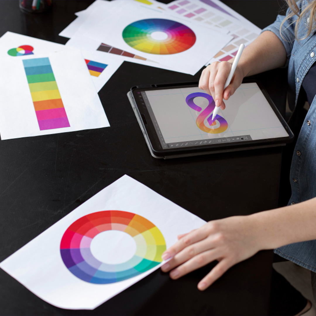
Moreover, colors are not just visual aesthetics; they are also a strategic sales element. According to research, approximately 90% of users decide solely based on colors during their first contact with a product. In this context, the color palette used on a website, the color of call-to-action buttons, menu contrasts, or background tones serve as the digital storefront of the brand. Designs that consciously use color psychology can influence users' purchase decisions from the very first second.
How to Create a Design Hierarchy that Guides Users
Guiding users on web pages is not just about placing buttons; it requires creating a hierarchy that manages the flow of attention. Where should the user focus at first glance? How should the main message stand out among other content? When answering these questions, a certain priority order should be established between titles, subtitles, text blocks, images, and buttons. For example, a large and bold title attracts attention, while a simple subtext just below guides the user. A well-placed CTA button eases the decision-making process.
Visual weight balance in design hierarchy determines user behavior. If all content is presented with equal intensity, users cannot decide and leave the page. However, with a carefully planned flow, the user first focuses on the main message, then dives into details, and finally reaches the call to action. Therefore, a successful web design should create a roadmap that guides the user step by step toward the goal, like telling a story.
Usage of White Space and Psychological Comfort
White spaces, meaning the gaps between contents, are silent but powerful communication tools of design. If a page is stuffed full of content, it creates a feeling of suffocation in the user. However, a page divided with sufficient white space is mentally clearer and perceived more comfortably. Users can more easily digest content on such pages and reach the information they want without distraction. This increases the time spent on the page and boosts engagement rates.
Additionally, important content can be highlighted through white spaces. For example, the space around a product image draws the eye directly to it. White space around buttons increases clickability. Spaces between text blocks make reading easier. In short, well-used white spaces provide both aesthetic and functional order. The design philosophy of “less is more” perfectly applies here.
Common Features of Trustworthy Designs
If a website does not convey trust at first glance, even the highest quality product or service loses its value. Therefore, the feeling of trust should be at the center of design. A trustworthy site should appear organized and clean. Quality images, legible fonts, simple menu structure, fast loading times, and mobile compatibility are the fundamental components of trust. Additionally, accessible contact information throughout the page, visible social media icons, and a professionally prepared "About Us" page support this perception.
Furthermore, user reviews and references reinforce trust. According to the principle of social proof, users bond more strongly with the brand when they see others' experiences. Security badges, SSL certificates, and familiar payment logos especially increase decision-making rates during purchase processes. A good web design should clearly convey not only that it is "beautiful" but also "trustworthy."
Mind Reading with Design: UX and Behavioral Psychology
UX, or user experience design, requires as much psychological knowledge as technical knowledge. Data such as where a user looks in which order on a page, when they make decisions, and where they give up are subjects of behavioral psychology. UX designers use this data to optimize the user journey. For example, according to the principle "fewer options make decisions easier," unnecessary menu clutter is avoided on the page. Or, following the rule "first trust, then action," user reviews are shown before product introductions.
Behavioral psychology forms the foundation for offering users an intuitive experience that doesn’t tire them. Properly placed CTAs, timely notification boxes, and short, clear guidance give users a sense of control. This feeling facilitates decision-making. The user feels guided, not lost on the page. Such an experience significantly increases not only purchase rates but also brand loyalty and user satisfaction.
FAQ (Frequently Asked Questions)
This section contains the most frequently asked questions by users along with detailed answers.
- Which colors create a sense of trust?
The color blue, which triggers a sense of trust, comes first. Especially widely preferred in corporate websites, blue tones create a perception of stability, discipline, and professionalism in users. Gray symbolizes neutrality and seriousness; it is generally used by finance, law, or consultancy firms. Green, by referencing nature, health, and environmental awareness, is a trust-inducing choice especially for healthcare and eco-friendly brands.
Although the effect of colors on trust may show cultural differences, these three colors carry common meanings in most regions. Moreover, the feeling of trust is related not only to the choice of colors but also directly to the tones, brightness levels, and usage intensity within the site. A non-fatiguing, balanced, and simple palette leaves a positive first impression on the user.
- What design details affect purchase decisions?
The foremost design detail affecting purchase decisions is visual prioritization. High-quality and professionally presented images of products or services play a critical role in persuading users. Next come clear pricing, graphics showing discounts, and secure payment logos, which ease the purchase journey. Product descriptions should be simple but detailed; user reviews and rating systems must be visible.
Additionally, an inclusive and guiding content layout speeds up the user's decision-making. For example, sections such as "Frequently Asked Questions," "Shipping Information," or "Return Conditions" being accessible reduce users’ doubts. This provides clarity in the decision process and directly increases conversion rates.
- Is there really a relationship between UX design and conversion rate?
Yes, there is a strong and scientifically proven relationship between UX design and conversion rate. The time users spend on a website, their interaction level, and likelihood of purchase depend on how smooth and intuitive their experience is. Poorly structured menus, slow-loading pages, or complicated payment processes quickly drive users away. Conversely, well-planned UX design removes all these barriers and guides users smoothly to the goal.
The effect of UX design is not only numerical but also emotional. If a user has a positive experience within the site, their trust in the brand increases. This trust not only influences that purchase behavior but also repeated visits, positive reviews, and brand loyalty. In short, UX is an invisible but the most powerful sales tool.
From your brand choice to which e-commerce package suits you, we work with you as a team on transitioning your business to e-commerce. Don't be intimidated by these stages. We will explain these steps to you step by step.
Leave Your E-Commerce to the Experts with Demresa Infrastructure.
Contact us now to get detailed information about starting e-commerce.
CALL ME